Chartbook #8
May 16, 2021
Hello everyone and welcome back to the Chartbook! It’s been two weeks since the last issue and a lot has happened in that time, so there is much to catch up on. Rates volatility has been picking up again after a brief lull and there have been a number of sharp moves and reversals. To get back on track after the week off, lets’s do an overview of a few notable trends and dig deeper into the details in the coming weeks!
Treasury Nominal & Real Rates
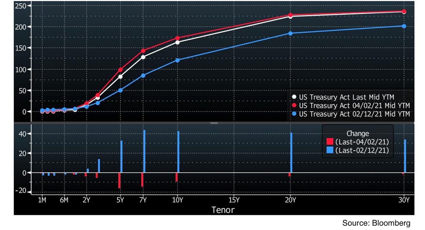
To begin, let’s look at what the Treasury curve has done since the latest high volatility period from mid-February to early-April.
The top panel here shows the US Treasury yield curve on February 12 (blue), April 2 (red) and at the close of last week (white). The bottom panel then shows the net changes in yield to date from mid-Feb and early-April as the blue and red bars, respectively. We see that since the earlier period of rates volatility began, yields past the 2 year point have risen significantly, while Treasury Bills have remained pinned around zero yield. The rise in yields since mid-Feb has been led by the 7 year maturity, though longer dated bonds have also participated significantly. Since early-April, however, the 5 to 10 year section curve has retraced some of its move, while the long and short ends of the curve remain relatively unchanged.
This year has also seen a significant move in TIPS yields and inflation expectation, so let’s take a closer look at what has happened there.
The top panel of this chart shows the US Treasury (white) and TIPS curves (red) at the start of 2021 (dotted lines) and currently (solid lines). Since both US Treasuries and TIPS are free of credit risk and treated fairly similarly in funding markets, the spread between the two curves is due mostly to expectations of the TIPS principal and interest payments increasing or decreasing due to the CPI adjustment. This spread is plotted in the bottom panel of the chart and relates to the inflation breakeven curve. Note that it is not exactly accurate to simply subtract TIPS yields from Treasury nominal yields to get the expected CPI (breakeven) rate, as compounding does not work linearly. For example a nominal Treasury yield of 100% and TIPS yield of 50% would require CPI of 33.3% per year to have the same nominal return, but for single digit per annum yields we can approximate it as a simple summation. Using this reasoning, the bottom panel shows that at the start of the year, CPI expectations in the TIPS market stood at a fairly flat 2% over the next 30 years. However, since then expectations on the short end of the curve have risen much higher (to around 3%) and dragged the rest of the curve up slightly. For some more detail, let’s see how this decomposition of Treasury yields into inflation expectations and a “real” inflation-adjusted component has progressed through time.
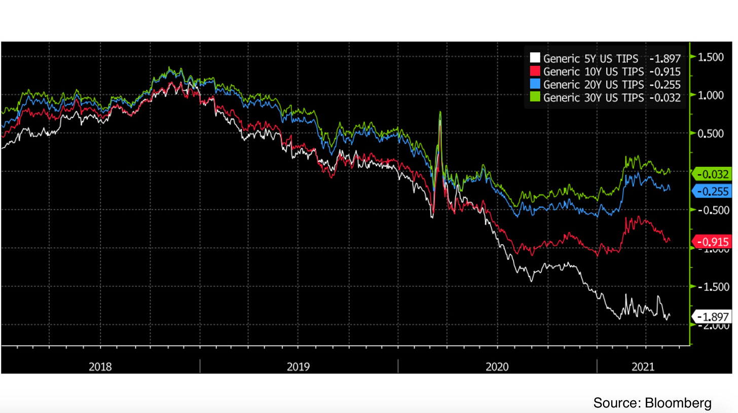
The chart above shows TIPS real yields for the 5 year through 30 year maturities. While 10 year through 30 year real yields have so far not dropped below Q3 2020 levels and rebounded from lows somewhat, 5 year TIPS yields (white line) have made new lows and remain deeply negative.
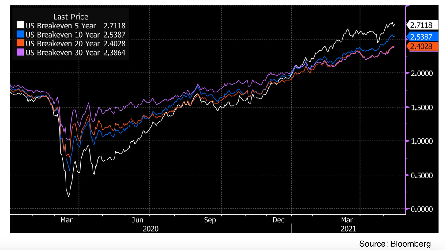
Now switching to the breakevens, we see that the CPI expectation component of yields has risen across the curve, but much more dramatically in the 5 year maturity than anywhere else. This reflects the fact that while 5 year nominal yields have been moving higher since early-August, TIPS yields in the same maturity have been making new lows, showing a strong bid for inflation protection over the next 5 years and driving the spread wider. This has caused the breakevens curve to become inverted (short-term expectations higher than long-term), which is an unusual condition that typically does not last (though it has occurred in the past a few times). For a clearer visualization of what is going on, let’s chart the nominal yields as a stacked combination of their two components.
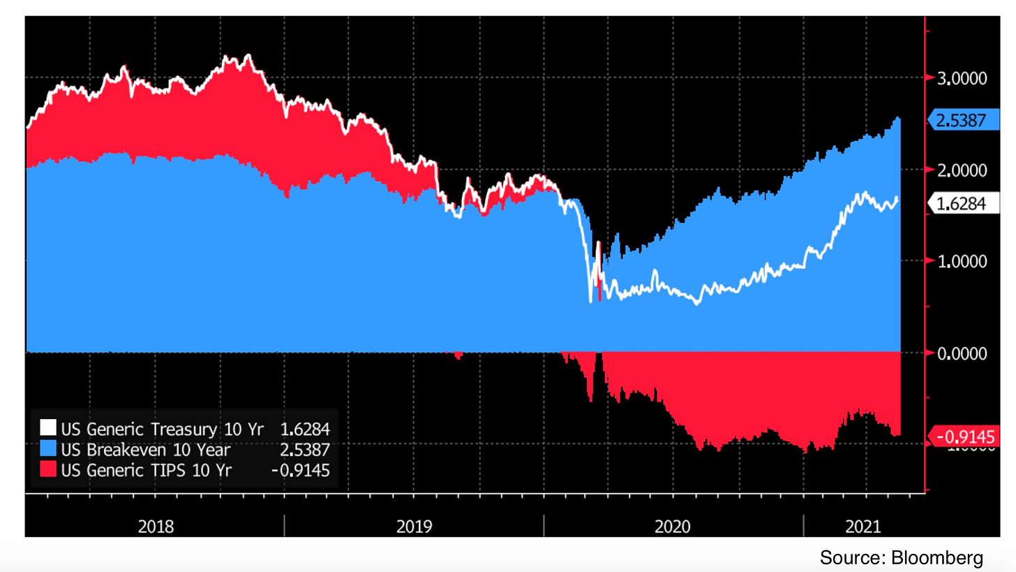
This chart shows the nominal 5 year yield (white line) as the sum of the 5 year TIPS yield (red) and 5 year breakeven (blue). When the TIPS yield goes negative, the shaded red portion is shown below the axis (instead of overlapping with the blue portion) for clarity. As we can see the 5 year TIPS yield has been mostly flat since mid-February, meaning that almost all of the rise in nominal yields has been due to the widening of breakevens. Now let’s turn to the same view of the 10 year maturity to see what is different!
This chart shows the same breakdown for the 10 year maturity, where we see the TIPS yield has leveled off much earlier than the 5 year TIPS did, and started to rebound off the lows in mid-February. This means that while the rise in 10 year nominal yields has been also somewhat driven by expanding breakevens, real yields have participated in the move as well. Since the 5 year and 10 year maturities are behaving somewhat differently, we can focus in on the source of the divergence by looking at the nominal and real forward curves. The 5 year 5 year forward rate tells us the implied yield on a 5 year maturity asset starting 5 years from now. This can be thought of as splitting a 10 year maturity into a “first half” and a “second half”. The 5 year maturity makes up the first half and the 5 year 5 year forward rates complete the second half to maintain an arbitrage-free relationship with the outright 10 year maturity.
This chart shows the same view as the two previous charts for the 5 year 5 year forward rates. Here we see that the real rate has participated even more than it has for the 10 year maturity, rising steadily from the bottom in August 2020 and turning positive in February of this year. If we suppose that the rates 5 year in the future are on the way to normalization (say to around 2018 levels) there could possibly be some further upside to the 5 year 5 year forward real and nominal rates. While this would not move current 5 year maturities, it would put upward pressure on both nominal and real 10 year yields (assuming breakevens remain relatively stable).
Now let’s look at some recent moves in swaps and interest rate derivatives to see how those markets are pricing in the policy reaction function based on these evolving growth and inflation expectations!
Swaps and Interest Rate Futures
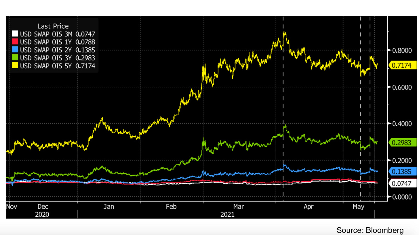
To start, let’s look at the overnight indexed swaps market. As discussed in a few past Chartbooks, an overnight indexed swap gives one party exposure to a compounded overnight rate (like the Federal Funds rate) over a given period of time. In return, the other party receives payments at a fixed rate. Thus, the OIS market reflects expectations for what the compounded policy rate would be over the lifetime of the swap.
The chart above shows the 3 month (white line) OIS rate and the 1 year, 2 year, 3 year, 5 year OIS rates in red, blue, green, and yellow, respectively. The vertical dashed lines show the times of the March jobs report (first line, beat expectations), the April jobs report (second line, missed expectations), and the April CPI reading (third line, beat expectations). While the near term OIS rates have remained pinned close to zero, rates past the 2 year point have moved significantly on recent news, pricing in different paths of Fed policy rates as market outlook shifts. The initial rise in tightening expectations in the first quarter of the year reached a peak with the March jobs report, before fading somewhat and entering a choppy sideways regime since late-April as traders look forward to summer FOMC meetings and the August Fed symposium at Jackson Hole for more clarity. In the meantime, large bets have been placed in the interest rates futures market looking to profit on moves in the expected policy rates path. To see what kind of moves these positions are targeting, let’s check out the Eurodollar futures market, which price inversely based on 3 month Libor and give traders direct exposure to future short term rates.
This chart shows the September Eurodollar futures for 2021 (white), 2022 (red), 2023 (blue), 2024 (green), and 2025 (yellow), with the same data reports marked with the vertical dashed lines. Similarly to OIS rates, the initial downward move in Eurodollar futures (upward move in implied rates) peaked at the time of the March jobs report with September 2025 Libor priced at around 2.25% and has retraced somewhat and traded sideways since then.
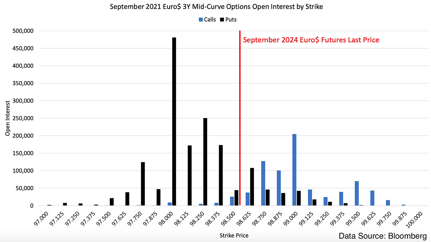
The instrument currently in favor with traders looking to bet on moves in the Eurodollar futures seems to be the 3 year mid-curve options, which are options on the futures contract maturing 3 years after option expiry. Of particular interest is the September 2021 3 year mid-curve (with the September 2024 contract in the green line as the underlying). Since mid-April, substantial open interest has been built in these option contracts, likely looking to capture exposure to both the summer FOMC meetings and Jackson Hole statements. To wrap up, let’s have a look at what kind of moves these large traders are looking to profit from.
This last chart shows the open interest in 3 year mid-curve options expiring in September 2021, with the approximate current price of the underlying contract marked in red. The underlying contracts here have a ‘face value’ of $1m (or $25 of exposure to a 1 basis point move in rates) so the largest bars on the chart represent quite a substantial amount of notional exposure. Notable here is the very high open interest in the $98 strike puts, which would become in-the-money at an expected September 2024 rate of 2%. This would require the market to price in about 2 additional rate hikes in 3 years over the summer and likely represents a bet that strong growth and inflation data will encourage the Fed to slightly accelerate the tightening timeline. On the other hand, there is also a substantial amount of upside open interest, such as in the $99 strike calls which would become in-the-money were Libor expected to remain below 1% through late-2024. These were possibly sold by the same traders buying the puts to fund their positions, setting up a popular structure called a risk reversal. There will likely be more action here as the summer progresses and new data resets market expectations, so future Chartbooks will probably go into more detail.
That is all for this week! Sorry for the unexpected break and slightly off-beat Chartbook schedule these past few weeks, as my own schedule has been a bit unpredictable and interfered somewhat with the writing process. Hope you enjoyed this catch-up edition if you made it to the end and I will look to return to the regular Chartbook timing and format next week :)
Cheers,
DC






Kind of tangential, but how do these Eurodollar options adjust for the expected phase-out of Libor?