


Hello and welcome back to the Chartbook! Hope everyone is having a great holiday weekend and some quality time away from the markets these past few days. This week’s issue will exclude the ‘Recent Data’ section at the end, but it should be back next week as a return to the format of the first couple of Chartbooks. There are no official themes here but this week will be mostly focusing on interest rate swaps. Okay, let’s get to it and hope you enjoy this (unofficial) Swaps Edition of the Chartbook!
Sections:
Treasury Yield Curve
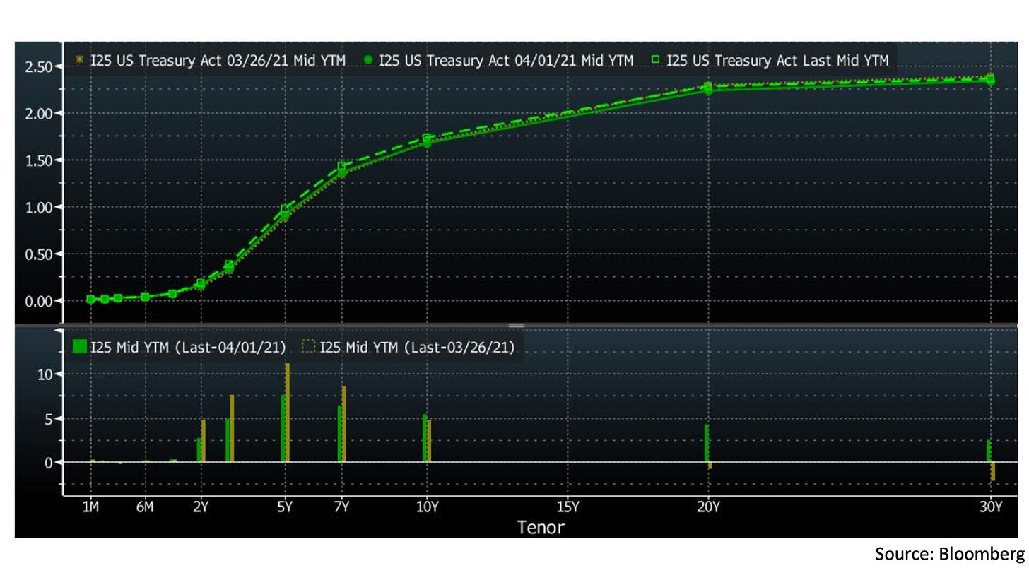
As usual, let’s start out by looking at the US Treasury yield curve. The top panel of the chart above shows the curve as of the close on Friday April 2 (green dashed line), the close of the last full trading day of the week on April 1 (green solid line), and the close of last week (brown line). In the bottom panel we see the net changes for last week (brown bars) and on Friday alone (green bars) in basis points.
We see that the 20 and 30 year bonds were little changed, rising in yield on the last day of trading but roughly flat on the week overall. The strong directional moves came in the 2-10 year bonds, with the bulk coming on the last day of the week, after a strong March jobs report was released. Yields here rose notably, led by the 5 year bond, as the market again priced in a higher minimal nominal rate of return for this time frame. For a closer look at how the market is adjusting, let’s move on to the swaps market for the next few sections.
Overnight Indexed Swaps


Before diving in, a quick primer on how an interest rate swap works. The diagram above shows the cash flows of a simple fixed vs floating interest rate swap. Two market participants enter a contract where Party A receives a floating interest rate based on an agreed benchmark, while Party B receives a fixed rate agreed at the beginning of the swap. The payments are calculated on the swap notional amount (which is not transferred) and occur at some agreed frequency (often semi-annually, for example). Interest rate swaps are a convenient way for market participants to adjust their exposure to interest rates, so the swaps market is large and well developed and reflects changes in market expectations quickly. Okay, now let’s look at some swaps.

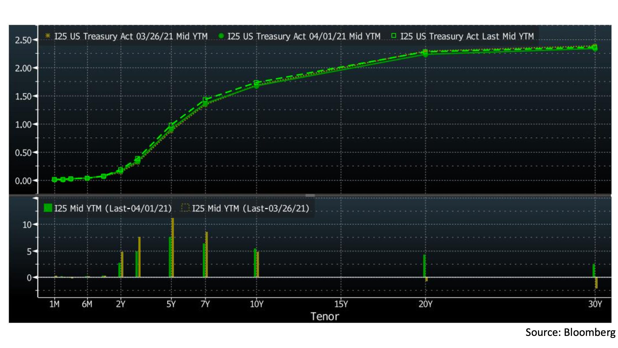
In the top panel of this chart, we see the US overnight indexed swap (OIS) curve at the same three points in time as the Treasury yield curve in the first section. The swaps here use the Fed Funds rate as their floating rate benchmark, and the chart shows the fixed rate parties would offer to receive payments at the Fed Funds rate for the given length of time. Because of this setup, the OIS curve reflects market expectations for the compounded Fed Funds rate over the lifetime of the swap.
Returning to the top panel of the chart, the solid green line is the most recent OIS curve as of the close of April 2, the brown line shows the OIS curve at the close of April 1, and the dashed green line at the close of last week on March 26. The bottom panel then has the net changes from last week (green bars) and April 1 (brown bars) in basis points. Here we see that the move up in Fed Funds expectations was concentrated in the 2-5 year maturities and occurred in large part after the jobs data was released (similar to the moves in Treasury bonds).
Note that while these two moves are related, they are not equivalent. Bonds move based on expectations of nominal returns acceptable under given economic conditions, while OIS moves based on expectations of the Fed’s policy reaction to economic conditions. In this case, bonds were pricing in higher returns available for the next 2-10 years, while OIS were pricing in higher Fed policy rates over the same time frame.
Swap Spreads


Since we saw in the last section that bond and interest rate swap rates do have some connections, it is natural to want to look at the spread between the two rates at the same maturity. This is a popular indicator in the swaps market know as the swap spread. In the top panel of the chart we have the yield of the 10 year Treasury (white) and the fixed rate on the 10 year Libor swap (yellow) while the lower panel shows the swap spread in basis points.
A positive swap spread means the swap rate is above the Treasury yield and vice versa for a negative spread. An intuitive way to understand this is that a positive swap spread means holders of fixed rate bonds (such as Treasuries) want to pay up for exposure to floating rates (suggesting outlook of rising rates over the term of the swap) while negative swap spreads means holders of floating rate exposure are willing to sell it at a discount to lock in some fixed rate at least (suggesting outlook of falling rates). This is of course just a rule of thumb, as there are many details in the swaps market that affect pricing, but hopefully it helps add some useful perspective here.
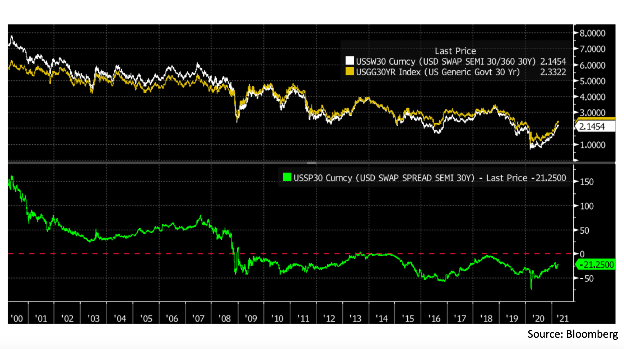
This next chart shows the same view for the 30 year maturity Libor swap, where we can see an even more pronounced tendency towards negative swap spreads post-GFC than for the 10 year swap. There are many theories for why the 30 year swap spread has stayed so persistently low. As far as I know there is no definite explanation, but the general low rate environment combined with lower demand for MBS hedging (which involves paying the fixed rate of a long-term swap) due to large Fed holdings of MBS are both commonly cited. Now let’s have a closer look at recent moves in long-term swap spreads!

In this chart we see the 10 and 30 year swap spreads over the last 6 months, with two key moments marked. The first marker (morning of Feb 17) marks the year-to-date peak in both spreads. Between mid-January and mid-February, swap spreads had been trending higher, as is to be expected in a rising rate environment. The 30 year spread had been moving less negative and the 10 year spread was pushing into positive territory. However on the morning of Feb 17 this reversed, and spreads made a sharp move in the negative direction until the second marker on the morning of Mar 19. This second time is also significant because it was when the Fed announced that the SLR exemptions for Treasuries and reserves were ending. Since then swap spreads have rebounded but failed to recapture their highs from February.
At first it seems a bit illogical that SLR rules would have an effect on swap spreads, but there are some second-order connections here that could provide an explanation. First let’s think about a theoretical carry trade using these Libor swaps, Treasury bonds, and the repo market:
Step 1: Borrow in the Treasury repo market to fund a position in 10 year Treasuries (pay the repo rate, receive the 10 year yield)
Step 2: Offset the Treasury position by paying the fixed leg of a 10 year Libor swap (pay the swap rate, receive Libor)
Overall, a trader in this position would be:
Paying: Treasury repo rate + 10 year swap rate
Receiving: Libor + 10 year Treasury rate
Netting these out, the trader would be receiving the 10 year swap spread plus Libor minus the repo rate. In theory, if repo rates and Libor could be predicted with perfect accuracy, there would be a risk-free arbitrage here unless swap spreads exactly equalled the spread between Libor and repo. In reality, this is not risk-free since Libor and repo rates move unpredictably, but swap spreads do seem to be at least somewhat affected by the Libor/repo spread.

In this chart we see the 10 year swap spread (yellow) plotted against the Libor/repo spread (white). While there are clearly other factors at play as well, we can see that for some periods (late-2012 through mid-2015 for example) swap spreads are actually following the theoretical arbitrage relationship very closely, while in other periods it seems to have a more muted but still notable effect.
So what does SLR relief ending have to do with any of this? My thesis here is that prior to the clarity provided by the Fed’s expansion of their reverse repo operations and end of SLR relief, there was some concern that the flow of new reserves coming from the Treasury General Account would have to be warehoused by US banks using foreign banks as ‘overflow’ capacity, which would put pressure on Libor. This view was expressed, for example, by Credit Suisse strategist Zoltan Pozsar in a Feb 16 note which contains the quote:
Unless banks get SLR relief and the o/n RRP facility is uncapped, we expect U.S. dollar Libor-OIS spreads to reach zero by June, with risks to the downside.
While banks did not get an extension of SLR relief, the expansion of the reverse repo facility and clarity provided by the announcement may have shifted consensus to the view that Libor would not come under pressure, but the surplus reserves issue would instead be resolved through the Fed borrowing more in the repo market (keeping the repo rate low, not Libor). This is also supported by the fact that Libor has risen slightly since the Fed made these moves, and is now at 20bps vs the March 18 print of 18.6bps.
Since the announcements seemed to have the effect of raising Libor while keeping the repo rate at around zero, I think this is a possible partial explanation for the rebound in swap spreads since Mar 19 given our observed relationship with the Libor/repo spread.
Swaptions
After that long and technical section on swap spreads, let’s change pace a bit with a more subjective look at swaps volatility. Like many other financial instruments, swaps have an options market too, which is called the swaptions market. A swaption gives the holder the option (but not obligation) to enter one side of an underlying swap of agreed rates and maturity at the time of expiry (many swaptions are European style, meaning they can only be exercised at expiry). By applying conventional options pricing methods to the swaptions market, we can construct an implied volatility surface across various swaption expiries and underlying swaps.

In this chart we see two snapshots of this implied volatility surface most recently (on the right) and four months ago (on the left). The horizontal axes here tell us the swaption expiries, and the vertical axis the implied volatility of an at-the-money swaption straddle (here a straddle means buying both a fixed-side swaption and a floating-side swaption, while at-the-money means the ‘strike’ rates on the underlying swap are the current rates). Each line shows the implied volatility for a different maturity of underlying swap (here called the ‘tenor’ in the legend).
Some subjective observations we can make here are that short-dated swaptions on all but the shortest maturity underlying have risen sharply in price, with the implied volatility curve now in strong backwardation for both the 10 and 30 year swaps. Also we can observe a notable rise in implied volatility in the 3-5 year-to-expiry swaptions on the shorter maturity swaps. These are both to be expected in an environment of high uncertainty around rates in the mid-term future, which has been the underlying theme in several earlier sections. The swaptions market thus gives us another way to observe these dynamics in a rather direct and elegant way.
Federal Funds Rate
Finally, let’s wrap up by moving on from swaps to the Federal Funds market, where a rather interesting event unfolded on the last day of the first quarter.

The chart here shows the Fed Funds rate (white) trading within the bottom half of the target range (between the red and green lines). The interest rate on excess reserves (pink) is paid by the Fed to banks that hold reserves as a way to set a floor to the Fed Funds rate, since theoretically banks would be unwilling to lend in the Fed Funds market at a lower rate than they could earn by just holding reserves. However, the NY Fed admits in this note that the mechanism is not perfect. The relevant quote points to government-sponsored enterprises as the reason for the floor not always holding:
While IOER has been effective at influencing the FFER, it has not served as a hard minimum rate at which all institutions are willing to lend funds. This is because some institutions are eligible to lend funds in the federal funds market, but are not eligible to earn IOER, such as the government-sponsored enterprises (GSEs).

The GSEs referred to here are almost certainly the Federal Home Loan Banks (FHLBs) which are know to lend substantially all of their available cash holdings in the Fed Funds market. In the chart we see daily Fed Funds volume (blue) against the most recent quarter-end figures for available FHLB cash. Since the FHLBs would otherwise be earning zero return on this cash, it makes sense that they would be willing to lend it at slightly lower rates than other banks. Thus, the FHLBs are dominant on the lending side of the Fed Funds market.
On the last day of the quarter, other banks often borrow less in the Fed Funds market for various reasons. This time around, quarter-end demand was low enough that the Fed Funds rate dropped 1 basis point to 6 basis points, falling to the bottom quartile of the range. Bidders returned the next day and the rate immediately bounced back, but the move sparked some speculation that the Fed might do something to prevent the Fed Funds rate from dipping so close to the bottom of the range again.
One way to do so would be to raise IOER slightly (to say 15 basis points from the current 10 basis points). This would encourage other banks to bid on Fed Funds offered by the FHLBs at a slightly higher rate, since they can now earn more interest on the borrowed cash.
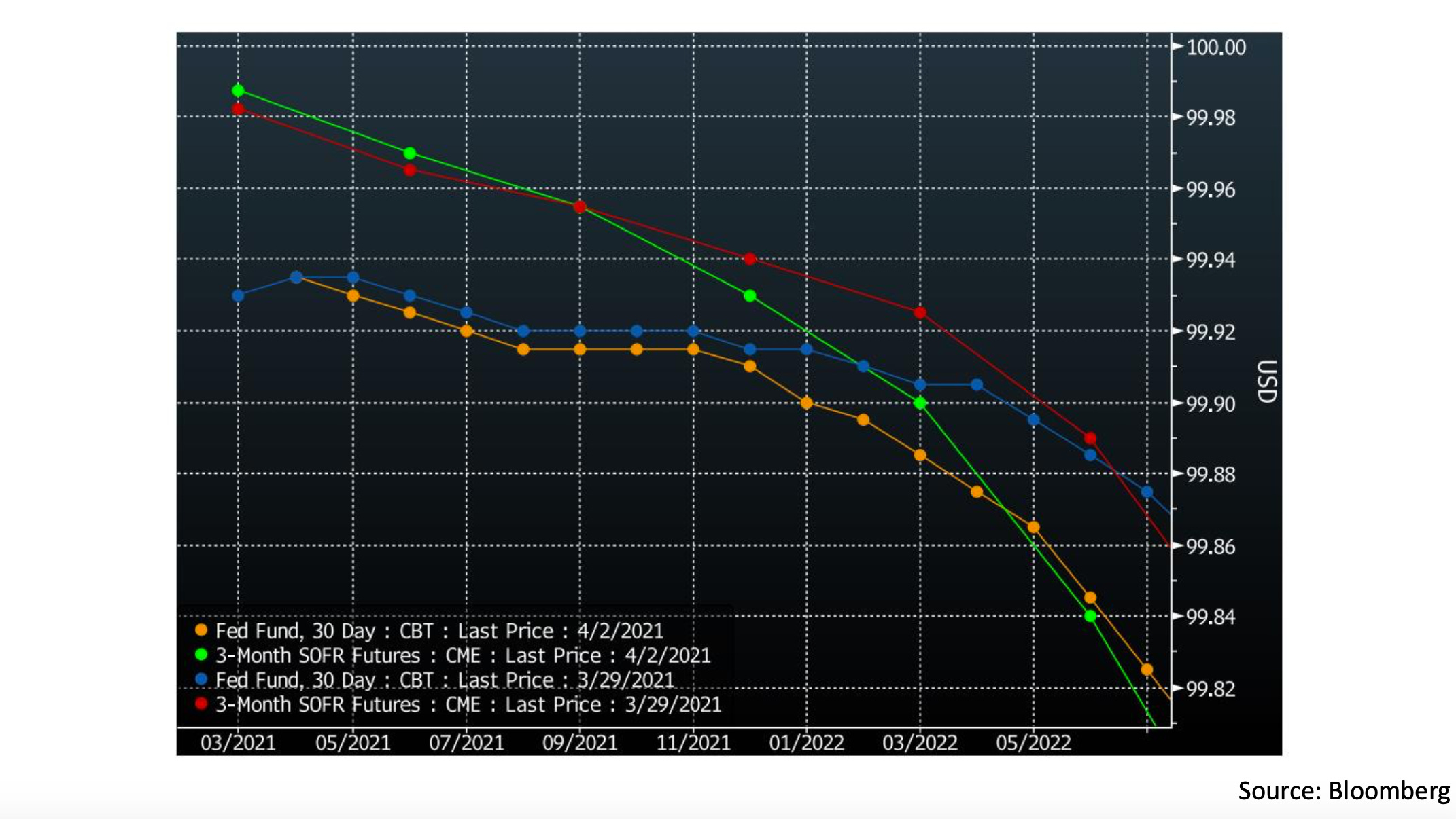
In this chart, we can see how the interest rate futures market may be reacting to this possibility. The blue and orange lines show the Fed Funds futures curve at the end of last week and currently, respectively. Since interest rate future trade inversely proportional to the rate in question, the move in the May 2021 through November 2021 futures shows the market expects a slightly higher Fed Funds rate over that period than it did a week ago. The SOFR futures (red & blue), which are tied to repo rates, have not moved similarly, which suggests the market may be partly pricing in a Fed IOER adjustment sometime in the next few months.
That is all for this week! Thanks for reading if you made it all the way through and hope to see you all in a week for the next Chartbook :)
Cheers,
DC
Hi DC, I'm missing your newsletter editions. I'm a student and your newsletter is a great way for me to understand what the technicals mean and how the numbers are connected with each other. You do a great job and I was going through past issues as I wait for a new one.
I wanted to humbly point out that you seem to have mixed the white and yellow lines in the swap spread chart vs the text accompanying it. The chart says the yellow line is the 10Y tsy yield while the text says it is white. Although it doesn't affect the conclusion or analysis, I wanted to share for accuracy.
Thank you.