
Chartbook #2
March 28, 2021

Hi everyone and welcome back! Thank you all for the great response to the first issue last week… glad people found the content interesting and appreciate all the feedback and comments! The Chartbook is free and provides informational content only (no advice or recommendations of any kind) so enthusiasm from the readers is what keeps this going. Thanks again for making the first issue a success and look forward to sharing these regularly going forward. Okay, let’s get started!
Sections:
Yield Curve
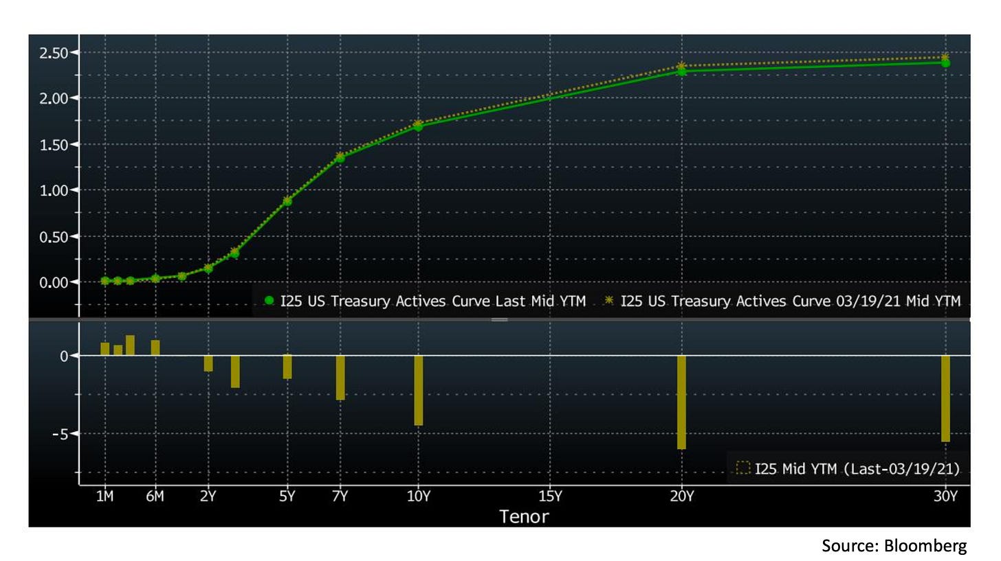
To begin, let’s look at the US Treasury curve like we did last week. On this chart, the top panel shows yields at the close of March 19 (brown dotted line) and March 26 (solid green line), while the bottom panel shows the net moves over the week in basis points. There are interesting things going on across the curve here so let’s look at three of them in more detail:
a) The yields on the 10+ year maturities all came down by about 5 basis points this week, led by the 20 year (a drop in yields here is a rally in the bond price)
b) The 2-7 year maturities also rallied in price, despite a weak 7 year auction on Thursday (yields were only down 1-2 basis points on this part of curve though)
c) Treasury Bills (1 year or less maturities) actually rose in yields (fell in price), backing away from negative-yielding territory
The remaining sections will have some theories and possible explanations for why these things happened, followed by a closing section on some recent research.
20-Year Bond
To understand why the 20 year bond led the rally in the long end, let’s look back at the history a bit. As explained in this Fed note from last year, the 20 year was reintroduced in May 2020 after not having been issued since 1986. For this reason, there are only 4 distinct maturity dates for 20 year non-TIPS Treasury bonds currently in existence. Three of them are in 2040 (May 15, August 15, November 15) and one is in 2041 (February 15). Since the market for 20 year bonds is still small, there has been some concern that they may not trade as smoothly and sometimes fall to a discount against the rest of the curve. At the end of last week, the generic 20 year bond was trading at 2.34% yield, while the 30 year bond maturing on February 15, 2041 was yielding only 2.22% (though partly due to its higher coupon) and the generic 10 year and 30 year yields were at 1.72% and 2.43%, respectively.
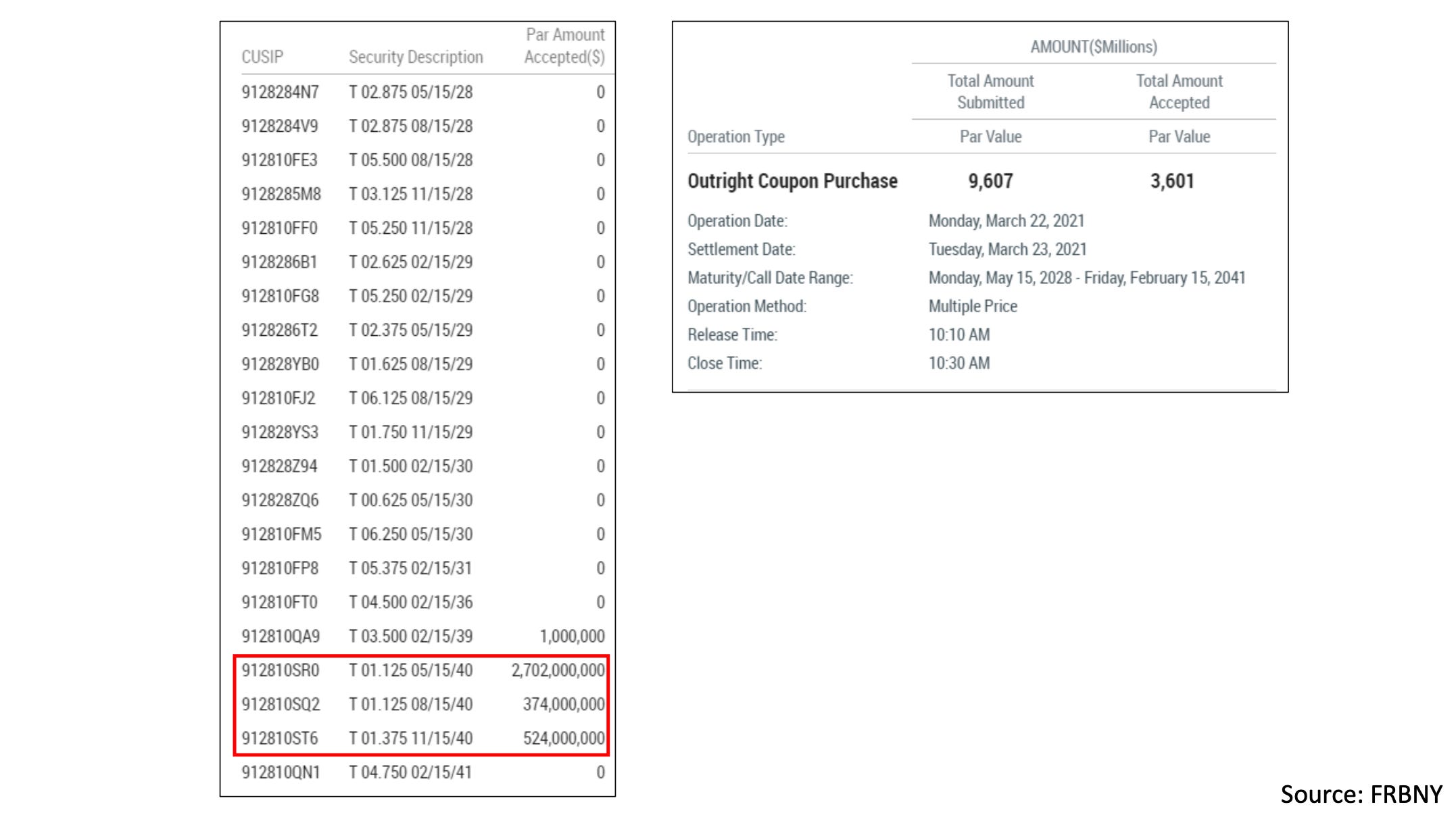
Now let’s look at what the Fed did on Monday in their scheduled asset purchase operation. The way these asset purchases work is the Fed puts out a list of bonds they are willing to buy and a total amount they are targeting, requesting quotes from the primary dealers. The dealers then come back with amounts and prices for the bonds they are willing to sell (usually more than the Fed is buying) and the Fed chooses which offers to accept. While almost $10B in offers were submitted on Monday for bonds ranging from 7 to 20 years to maturity, the Fed concentrated the overwhelming majority of their accepts in last year’s issues of the 20 year bond. Note that this year’s 20 year issue, the on-the-run 20 year, was excluded from the buying list (the 2041 bond listed is the 30 year maturing in 2041 mentioned earlier). This is typical of the Fed’s recent practice of leaving on-the-run bonds on the market as they are the most actively traded.
In conclusion, the theory here is that buying the 20 year in size on Monday signaled to the market that the Fed believed it to be cheap. This suggests that the Fed is not always a price-insensitive buyer as is sometimes said. In this case, they may have reacted to bonds trading at a slight discount in a way that both boosted their P&L and encouraged the market to step in and correct the spread.
As a side note, the Fed also released its 2020 audited financial statements on Monday here. The Statement of Operations that includes the P&L of the Federal Reserve System is on page 4 for people interested in the details there.
7-Year Auction
Switching over to the 2-7 year section of the curve, we had a weaker than expected 7 year auction on Thursday, though not quite as weak as the previous one that set off a flash crash in bonds on February 25.
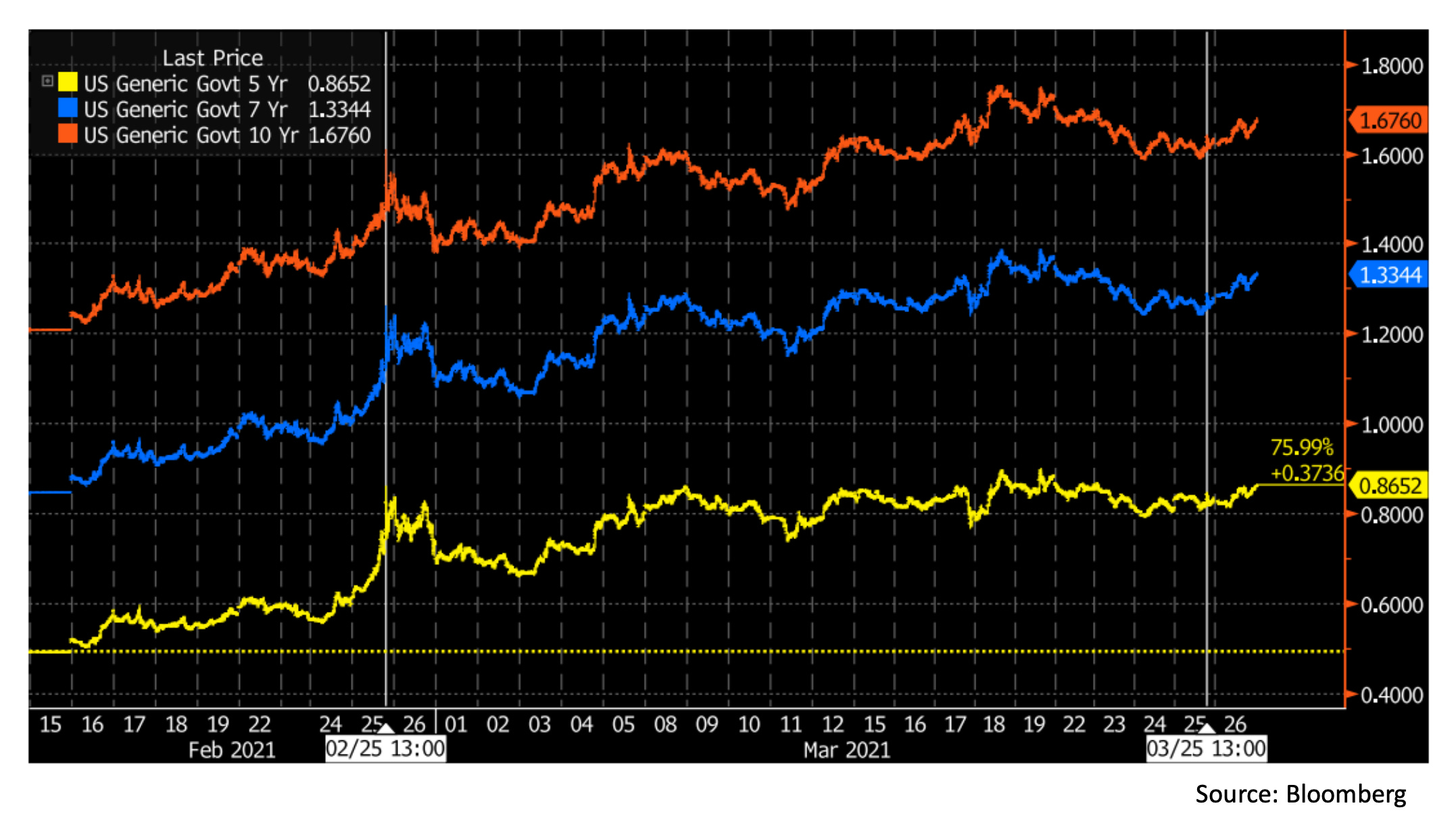
In this chart, we see the 10 year (red), 7 year (blue), and 5 year (yellow) yields over the past 6 weeks or so, with the two latest 7 year auctions marked by the white lines. So, if both auctions were weaker than expected, why did we see a violent rout in February but only a small blip this week?
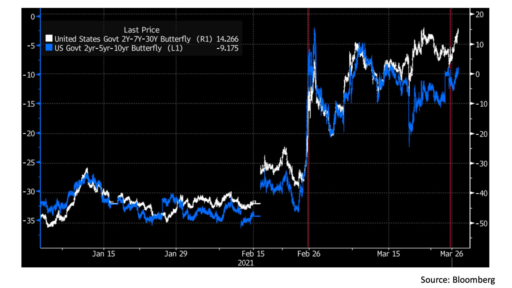
For a partial explanation, we can look to this chart of two US Treasury butterfly indices, with the same two events now marked in red. The two time series plotted are proxies for:
White - long 2 year Treasury, short 7 year Treasury, long 30 year Treasury, overall duration and long/short neutral
Blue - long 2 year Treasury, short 5 year Treasury, long 10 year Treasury, overall duration and long/short neutral
While every bond portfolio is different, these indices give us an idea of the incredible volatility that levered relative value trades may experience. As discussed in last week’s Chartbook, yields move according to investor expectations of the minimum acceptable nominal return over a certain time horizon, and can thus shift relative to each other quickly in times when economic narratives are in flux. For traders positioned short these indices (betting on price appreciation in the 5 or 7 year relative to the ends of the curve), the increased confidence in higher nominal returns over medium time horizons since February 16 has been painful.
What likely happened on February 25 is that the weak 7 year auction served as a catalyst for a rapid deleveraging of many of these positions as traders on the wrong side were stopped out. While the surge in volatility likely led to de-grossing across bond portfolios, the role of relative value exposures is suggested by the extreme moves in the butterfly indices. With leveraged reduced after the February 25th flash crash, this week’s disappointing auction did not result in similar fireworks.
Treasury Bills and Short-Term Rates
Now moving on to the short end of the curve, let’s check in on what has happened since the Fed raised limits on how much it was willing to borrow in the repo market to keep rates above 0% on March 18 (discussed in more detail in last week’s Chartbook).
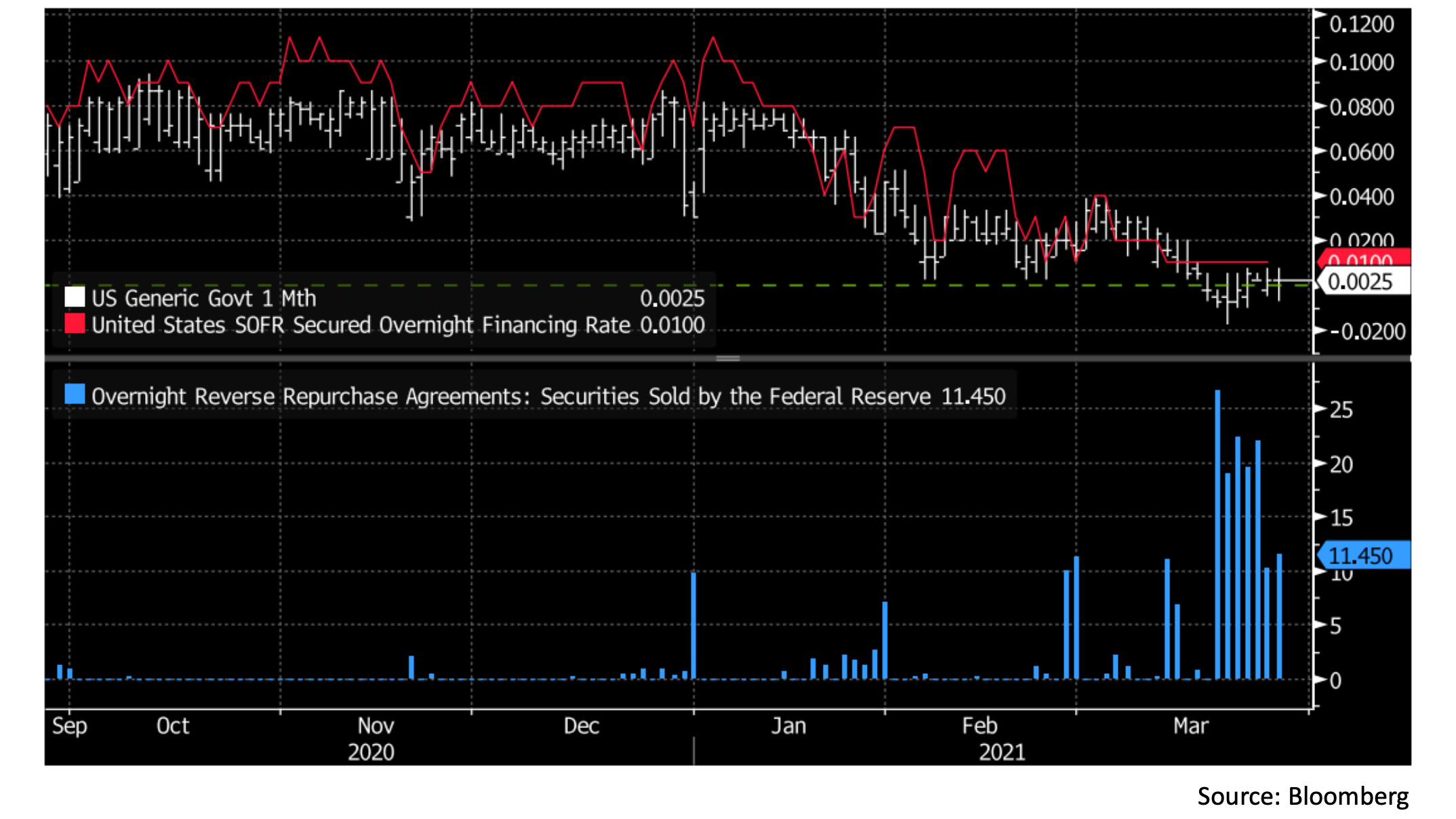
On this chart we have the top panel showing the 1 month Treasury bill yield (white) and SOFR (red) while in the bottom panel we have the Fed’s daily overnight borrowing in the repo market through the RRP facility (blue, in $ billions). We see that since the Fed increased its borrowing limits late last week, short-term rates have stopped grinding lower and stabilized around zero. For now, it seems that the RRP facility has set a floor for short-term rates (as it is intended to) but some uncertainty in the short-term markets still remains. For a closer look at this uncertainty, let’s check out some futures contracts tracking interbank interest rates over the coming year.
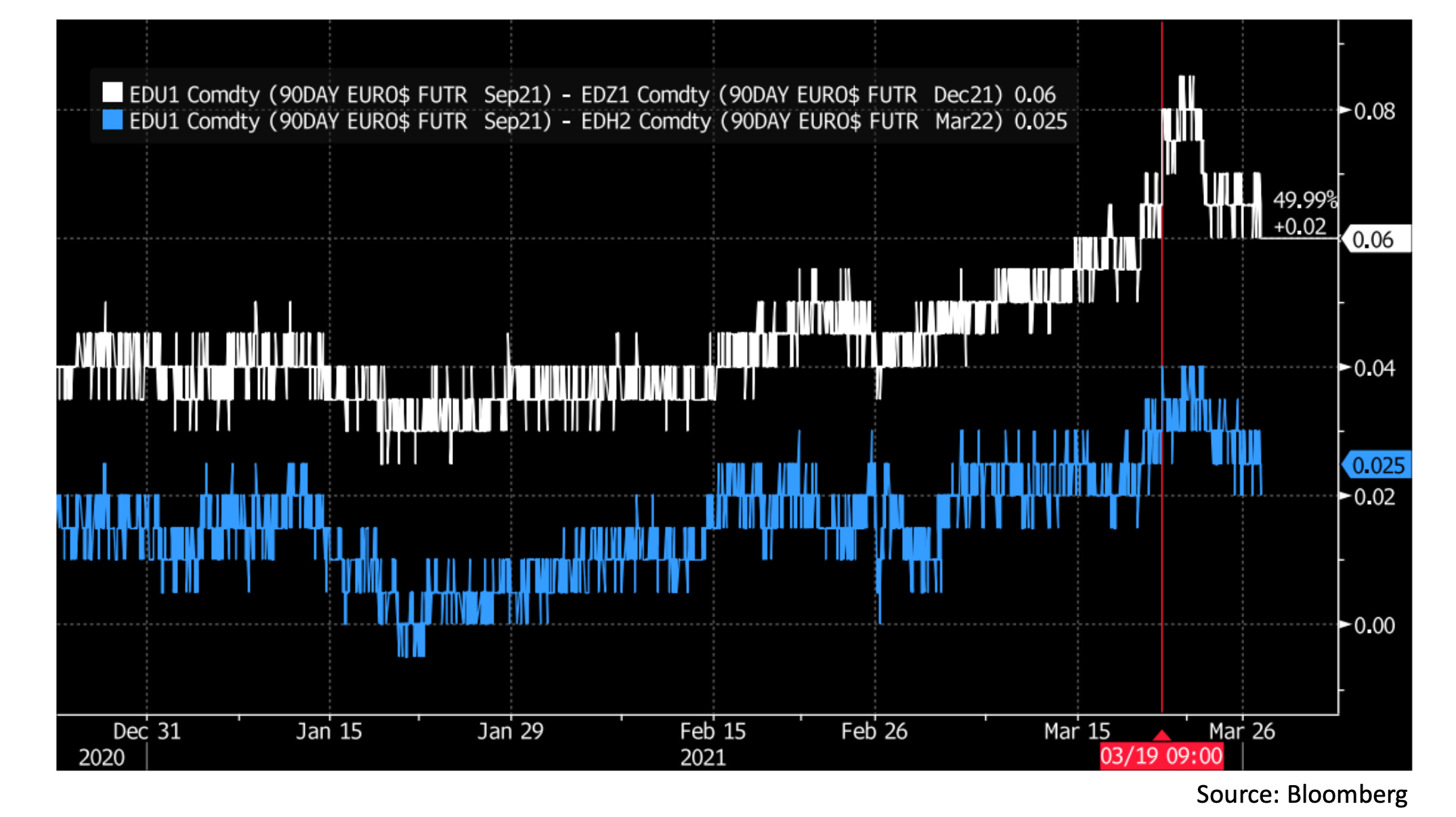
In this chart, the white line shows us the implied difference in Libor between December 2021 and September 2021 in the interest rate futures market. The spread of 6 basis points implies that the market expects December Libor to be higher than September Libor by that amount. Since Libor is affected by policy rates, I have also included the implied difference between March 2022 and September 2021 Libor as the blue line. The spread there is only 2.5 basis points, so we see that the market is not pricing in a significant chance of a rate hike between September and next March. This suggests the reason for the spread in the December contract must be something else. In practice, it is not uncommon for December interest rate futures to trade slightly out of line with other contracts, as traders take positions to hedge interest rates at the end of the year, when seasonal factors sometimes lead to more stress than usual.
What is interesting here is the brief spike of upside risk perception in December Libor that followed the Fed announcement on March 19 (at 9am EST) that temporary exemptions to bank capital requirements will expire at the end of the month. While the move was short-lived and fully reverted this week, it suggests the market remains unsure how banks will act in the funding markets come year-end. With the current level of uncertainty and a number of regulatory issues (G-SIB scores, asset growth caps, etc.) being debated, I am sure this is an area we will come back to in future Chartbooks this year.
Recent Research:
Now switching to recent publications and data, let’s wrap up by going through a few details of this NY Fed note published on Wednesday. The note analyses conditions in a variety of markets during the hight of volatility in the first half of 2020, but for this section we will focus on mortgage-backed securities.
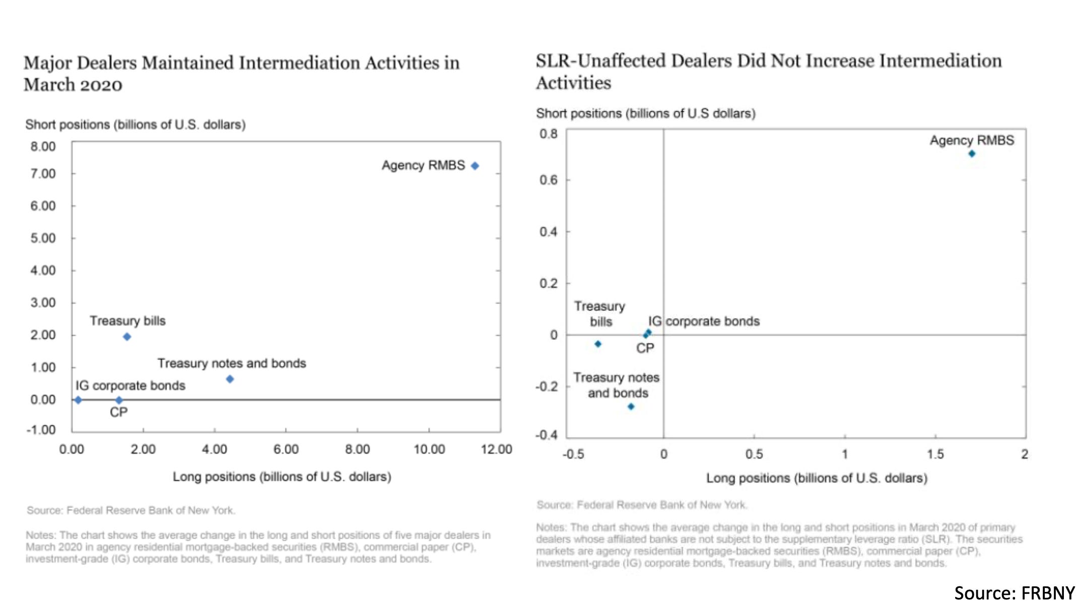
These charts show the net changes in long & short positions for the five major primary dealers (left) and smaller primary dealers unaffiliated with the major US banks (right) during March 2020. In times of market stress, dealers would be expected to intermediate by taking both long and short positions onto their books, supplying the needed liquidity for traders to unload or adjust positions. As we can see from the charts, dealer intermediation was by far most active in the Agency residential mortgage-backed securities market according to this metric. To understand why this is so, let’s first look at the Agency MBS market structure and some of the unique elements of trading these securities.
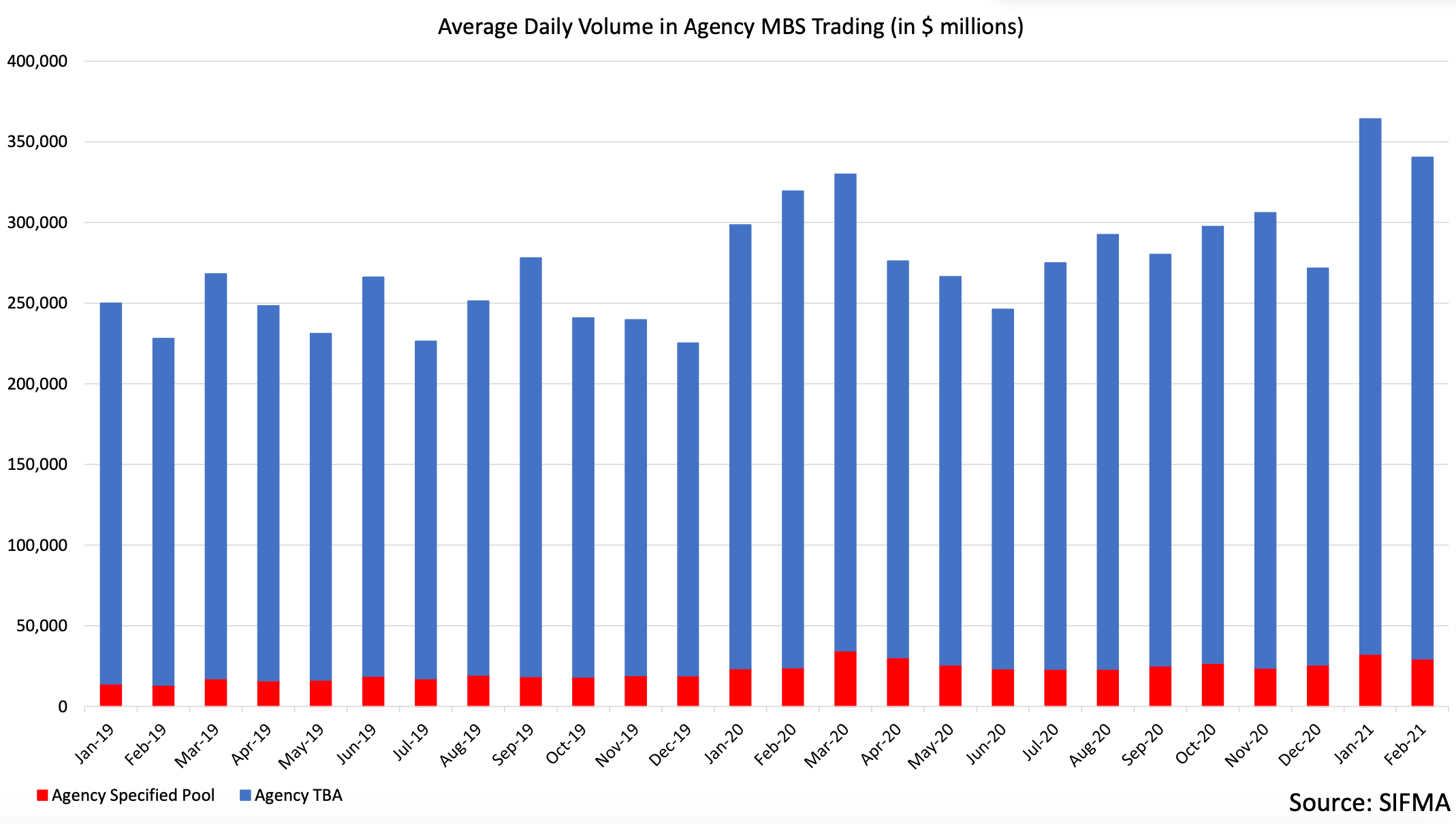
The chart here shows average daily trading volume in the Agency MBS market over the past few years. The red section of the bars represents the volume of specific securities traded (this can be thought of as the ‘normal’ trading mechanism most markets use) while the blue section represents a mechanism called To-Be-Announced (TBA) trading. As can be seen from the chart, TBA trading is very well developed and makes up the bulk of Agency MBS market volume.
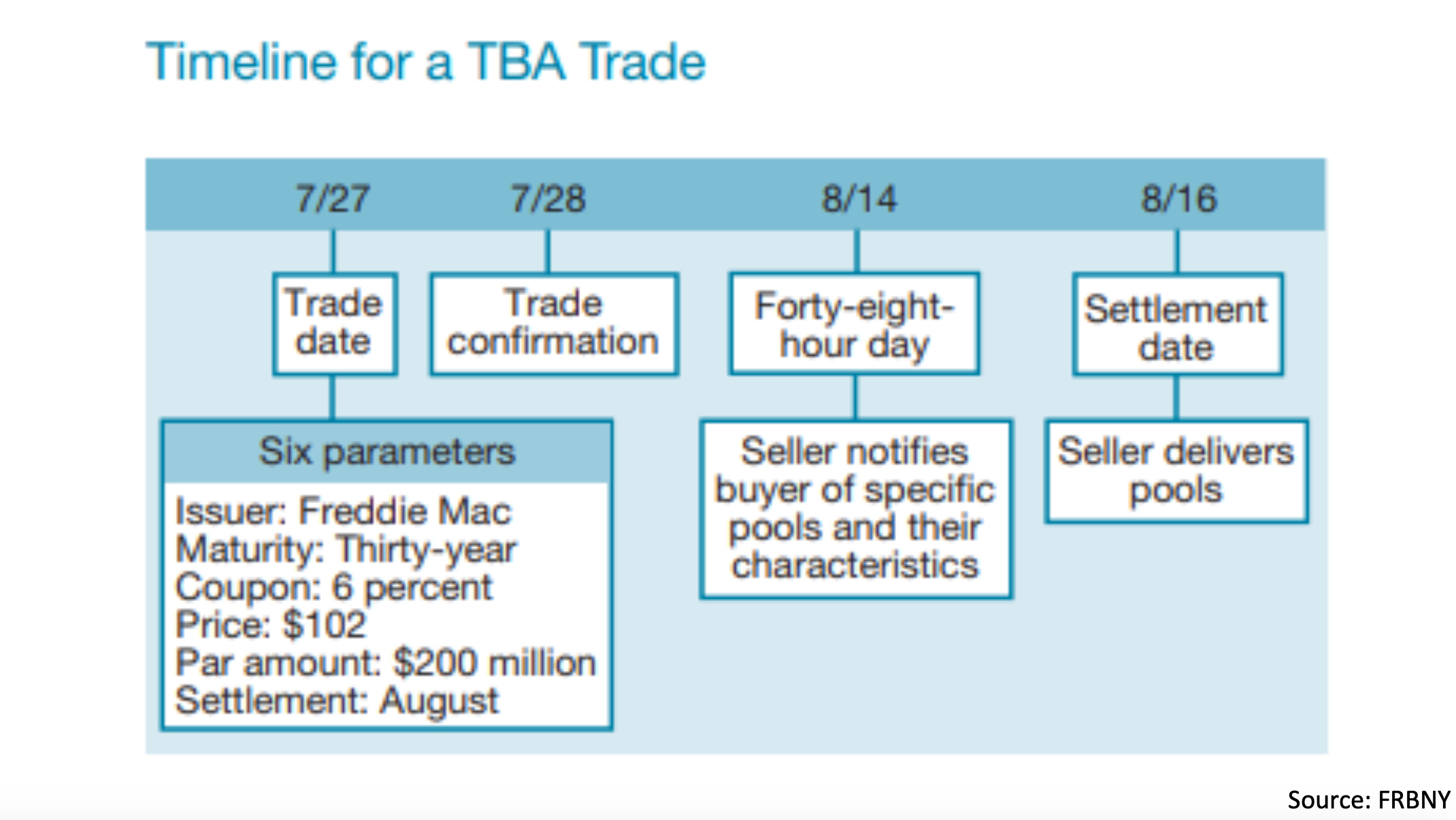
In this diagram, we see the details of what a TBA trade entails. One way to think about this is as a futures contract on an unspecified Agency MBS that meets certain requirements. To carry out a TBA trade, counterparties would agree on the 6 parameters shown on the day of the trade, with a settlement date at some point in the future. Two days before the settlement day, the TBA seller notifies the buyer of what specific security they plan to deliver for settlement. This is usually the cheapest available security meeting the agreed parameters, which is why TBAs are sometimes called a ‘cheapest-to-deliver market’. On the settlement day, TBA trades can be settled on a net basis through a centralized platform operated by the DTCC, allowing traders to cancel out offsetting trades with the same parameters and keeping ‘physical’ settlement of Agency MBS low.
Since all specific Agency MBS are slightly different, the TBA market has the advantage of similar pools being temporarily fungible, making trading much more convenient and liquid. As a side note, there are several unique types of transactions that can be facilitated with this mechanism. For example, a trader that has purchased a TBA settling on a certain date but wishing to postpone delivery could simply sell an offsetting TBA for that date and buy another one for a few months later (this is called a ‘dollar roll’). The offsetting trades on the initial settlement date cancel out with no transfer of assets and delivery is postponed.
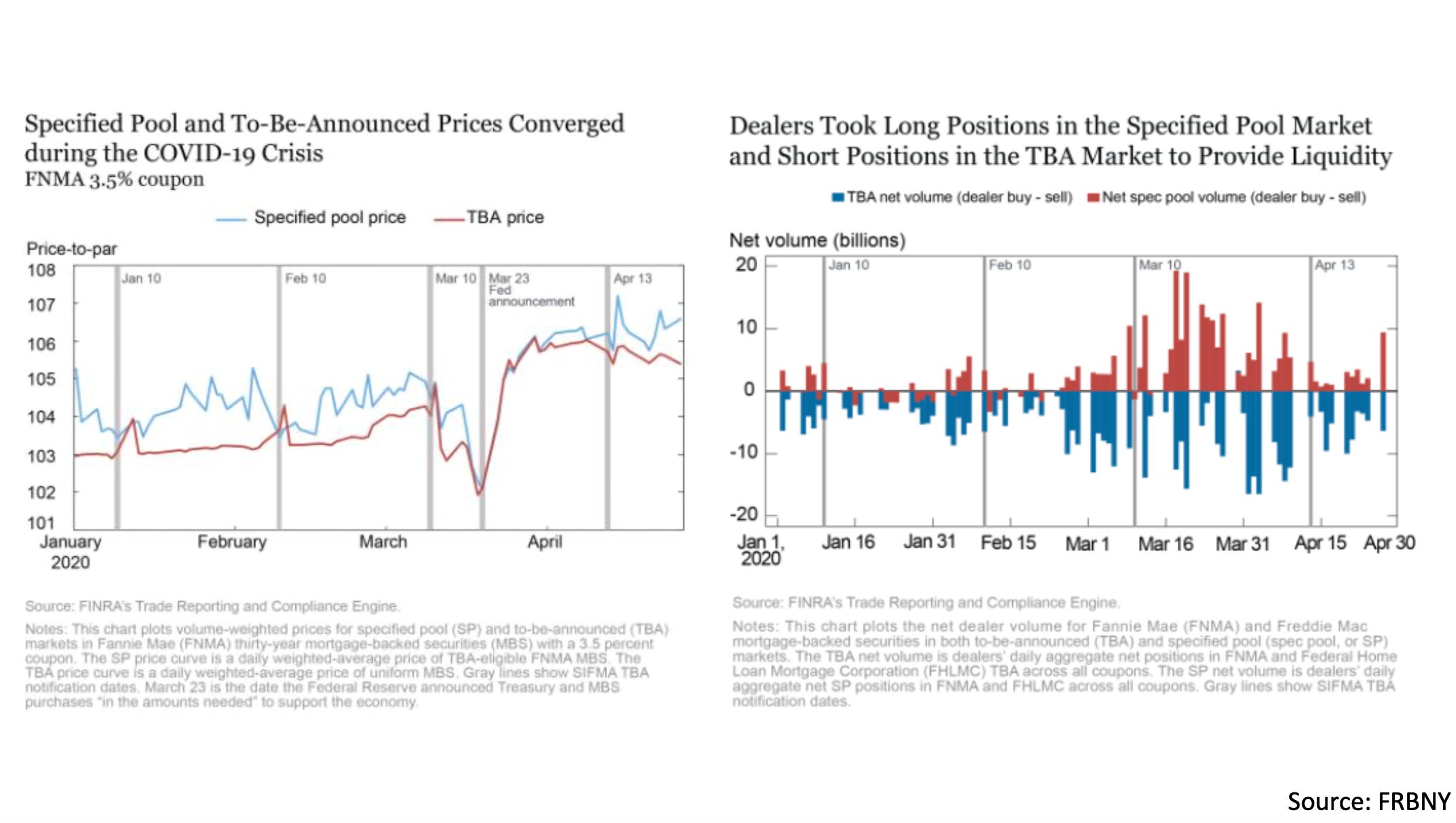
Now that we’ve gone through the basics of TBA trading, let’s close by unpacking how this affected dealer intermediation during last year’s market stress. In these charts from a different Fed note, we see on the left panel that specified pools usually trade at a slight premium to TBAs. This is understandable as the specified pools represent the underlying security, of which the cheapest is usually delivered in a TBA trade. This premium in the specified pool market disappeared in March 2020 as the underlying and TBA became effectively equivalent.
On the right panel chart we see an illustration of how this happened. In the market panic, customers dumped their specified pools to dealers (as shown by the mostly positive dealer buy volume in the red bars) while dealers hedged their inventory risk by taking offsetting short positions in TBAs (some with the NY Fed as a counterparty). This convergence of the illiquid underlying and vastly more liquid TBA market helped dealers intermediate more effectively in Agency MBS than in corporate bonds or CLOs, for example. While Agency MBS still suffered significant peak-to-trough drawdowns in the crisis, the existence of this unique market structure may have helped avoid some of the worst outcomes.
That’s all for this week! Thanks for reading if you made it all the way through and hope to see you back next Sunday for the next issue :)
Cheers,
DC
Hello. Regarding the 7-year auction weakness. Maybe the first bout of weakness coincided with the FedWire freeze on the 24th of February and thus that produced the full body dry heave we observed in the 5 to 7 to 10-year yields?
Thanks. An eye opener as I have only been long or short Treasury ETFs.
My impression is that the CPI on 13/4 and/or the following 3 months may be higher than the market expects. I was looking to sell the 10 year Treasury leading upto 13/4.
I am not sure if selling the 10 year is the optimum strategy or I could sell other durations/combinations? Thx.