Welcome to the first Chartbook! In this and future issues, I plan to recap recent events in bond and credit markets and share some thoughts for discussion. There will also be a section at the end to go over recent data in a more open-ended way. Nothing here is in any way advice or rigorous research, but I hope everyone enjoys the charts and sees some ideas they find interesting. Okay, let’s get started!
Sections:
Yield Curve
Let’s start with the US Treasury market, since it is the biggest and most impactful. The top panel of the chart shows the Treasury yield curve at the close of 3 different days: Friday March 12 (brown dotted line), Tuesday March 16 (dashed green line), and the current curve on Friday March 19 (solid green line). In the bottom panel we can see the moves from last Friday to now (green bars) and from Tuesday to now (brown bars) in basis points.
As we can see the bulk of the net moves came after Wednesday, which was the day of the Fed’s latest policy announcement and press conference. The moves were largest in the 7 and 10 year maturities, which can be understood as meaning that uncertainty is greatest for fair nominal rates at those durations. This is likely because the market is confident that risk-free returns above zero are not to be had for the next few years at least, while long-term expectations are also stabilizing a bit. Thus the bulk of uncertainty resides in what economic conditions will be like 5-10 years from now, which makes these bonds volatile as their yields should set the floor for what nominal return investors are willing to accept over this time horizon.
Interest Rate Futures
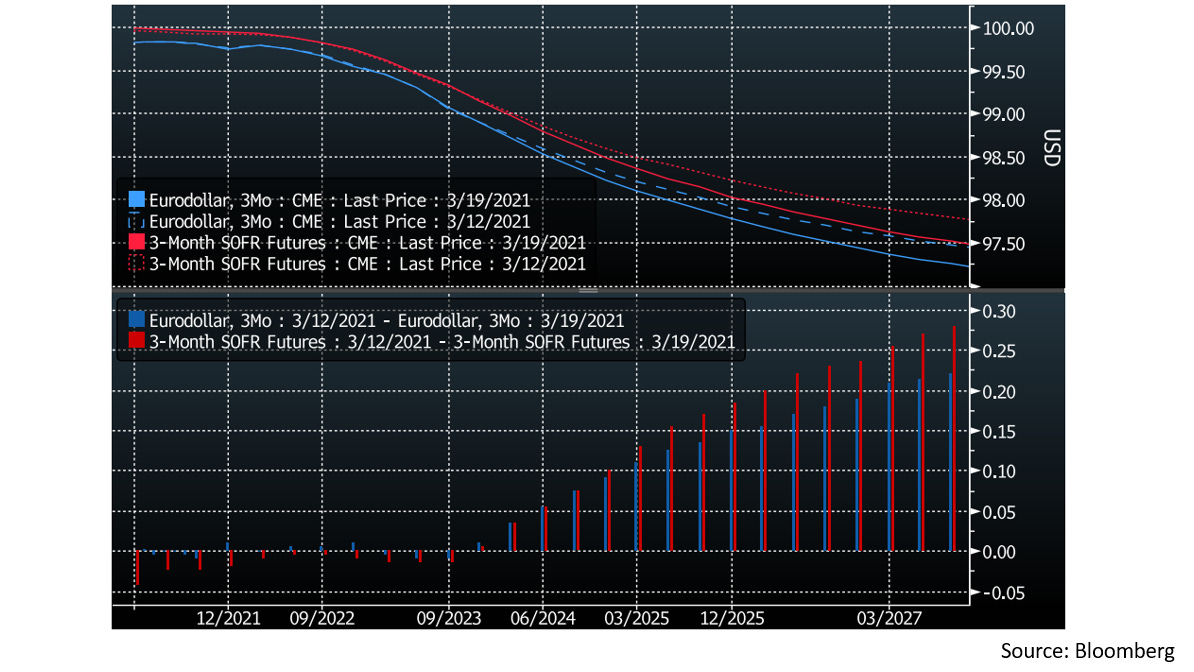
Switching over to interest rate futures, we see here a direct reflection of market policy rate expectations through the SOFR futures. The way interest rate futures are priced is $100 * (1 - rate), so the curves in the top panel here are to be interpreted as a mirror image of the Treasury yield chart I showed in the first section (97.5 here is 2.5% on the yield chart, for example). The bottom panel (red bars) again shows the moves from March 12 (dashed red line) to March 19 (solid red line), but now also inverted relative to the previous chart (bar up means rate lower here).
From the bar chart we can see that there was a notable adjustment in the curve starting around late-2023, pricing in lower Fed policy rates than expected last week starting around there. To clarify, lower policy rates being priced in here and higher bond yields in the previous chart are not contradictory… a wider range of outcomes in the medium term should price the intermediate Treasury maturities closer to the long-end of the curve, resulting in a steeper Treasury yield curve in the 5-10 year range. This is not counter to the reading the SOFR futures are giving us, which is that the market priced in a marginally more dovish post-2023 Fed now than it did a week ago.
As a side note, also on the chart are the more liquid Eurodollar futures, which work in the same way but reference Libor. Since the coming phase-out of Libor has fixed the spread between these two rates post-2023, the Eurodollar futures can be watched as a proxy for the less liquid SOFR futures past this point (despite the rate becoming obsolete soon, Libor-linked futures still trade in much higher volume).
Fed Reverse Repos
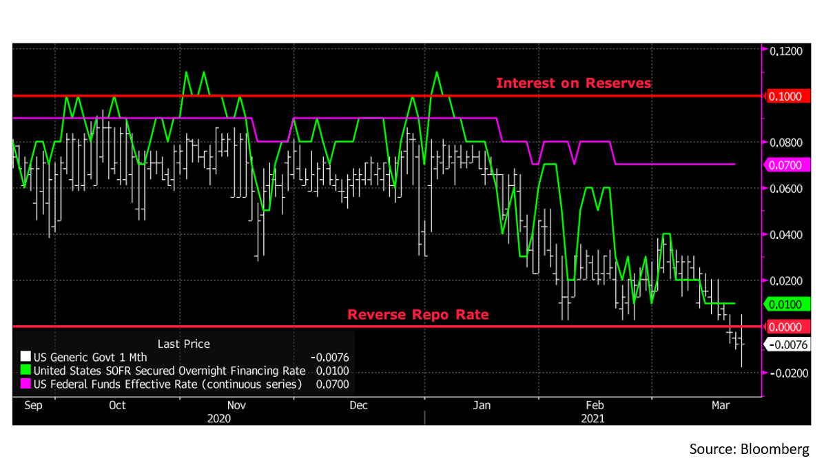
Another interesting event of the past week has to do with the tools the Fed uses to manage the 3 key short term money rates: Treasury Bills (white line), repos (green line), and Fed Funds (purple line). The intuitive understanding here is that the T-Bill rate represents how much one could earn by lending to the US Government for the shortest possible duration, the Fed Funds rate represents how much banks can earn by lending reserves held at the Fed to each other, and the repo rate represents how much securities dealers can earn lending to each other against the best possible collateral (in this case US Treasury securities).
These rates are all very close to (or effectively) risk-free and almost always trade within the range the Fed targets for the Fed Funds rate when it sets monetary policy. To ensure the Fed Funds rate does not slip below the lower end of its target (currently 0%), the Fed pays banks 10 basis points of interest on reserves, which should in theory discourage them from lending those reserves to anyone below that threshold. In practice the Federal Home Loan Banks (FHLBs) are ineligible to earn positive interest on reserves. Thus, they are willing to lend at slightly lower rates and the Fed Funds rate is currently at 7 basis points, but likely cannot go much lower as that would create an attractive arbitrage opportunity for other banks (mainly foreign bank offices in the US) to borrow and simply hold reserves.
The tricky part comes in because the Fed also acts as a borrower in the repo market as a tool to prevent repo and T-Bill rates from falling below the low end of its range. This is represented by the reverse repo rate at zero on the chart. Since lending to the Fed is as risk-free as can be, no repo lending should occur below that level and T-Bill holders should be willing to sell at negative yields and place their cash with the Fed instead to lock in profit.
The issue here is that the Fed is not a frictionless actor in the repo markets. It only transacts with the primary dealers and certain money market funds and sets a limit on how much cash it will take from any one counterparty. With new reserves entering the banking system from the Treasury General Account and a $30B cap per participant until March 18, there was some anxiety that money market funds (as large T-Bill holders) would be unwilling to sell their T-Bills even if yields went deeply negative for fear the Fed would not be willing to take enough cash on their hands to meet their investment mandates. This was relieved when the Fed announced on Wednesday afternoon that it would be taking up to $80B per participant starting March 18.
After this, usage of Fed reverse repos surged and T-Bills found a floor with yields hovering in a few basis point range around zero, meaning there are willing sellers in the materially negative yields. According to my back of the envelope math, the Fed will need to warehouse somewhere around $500B in excess reserves on an ongoing basis through this mechanism by the end of the year as more reserves continue to enter the system (possibly spiking higher for brief periods as the glut plays out in real time). This is of course just a rough estimate but I think within the right ballpark if the status quo persists.
US Mortgage Backed Securities
Now let’s check in on a story that has been playing out for a a few weeks in the mortgage backed securities market. I have been following this closely since it is a very elegant example of convexity in bond markets. What is happening here is that as mortgage rates (red line) are rising, it is driving down the volume of mortgage refinancing (blue). This has the effect of lengthening the duration (white) that a holder of a mortgage-backed security is exposed to, since the cash flow that would have come earlier through refinancing is now postponed. In a rising interest rate environment, this has the effect of making residential mortgage-backed securities trade like an increasingly longer duration bond (negative convexity), which in turn reinforces the negative effects by increasing the costs of mortgage funding.
These convexity driven moves can trend for a while before they run out of steam. So far the average US mortgage-backed security duration (red) has more than doubled off the lows from last year to over 4 years, and the yield has gone up roughly in line with other high-grade bonds. The current drawdown in total return terms is approaching 2% which is still smaller than the 2013 and 2016 drawdowns by some margin, but I would not be surprised if we exceed one (or both) by the time this move bottoms.
Treasury Auctions
Finally, to watch for next week, we have some Treasury auctions coming up that could help gauge sentiment around the more volatile parts of the yield curve. Starting off this coming week we have $185B in T-Bills and $60B in 2s coming up for auction on Monday and Tuesday, all of which the market should be eager to get its hands on. On Wednesday we have an additional $26B in 2s and $61B in 5s coming up, and the week wraps up with $62B in 7s on Thursday. I think it may be interesting to see how those 5s and 7s auctions go for a closer read on those maturities, all the shorter-term stuff I expect to be heavily bid.
Recent Data Releases:
Now that we’ve gone through some active market themes, this part will take a step back and look at lower-frequency data as it comes out. It may be a short section or omitted from some Chartbooks, but we have a few things to look at for this one!
Treasury International Capital (TIC)
Every month the Treasury puts out a report on holdings of various securities around the world (most focused on Treasury bonds). This data is lagged by a few months so the January 2021 update just came out in March, but it has some cool details so let’s look through it.
The table I see most often discussed from this report is the list of major foreign holders of US Treasuries, so let’s start with that. This data can be especially interesting in months where holdings of jurisdictions dominated by clearing houses or other financial entities change substantially, as in the places have marked on the table. These changes can represent inflows (green boxes) or outflows (red boxes) of collateral to a specific location, which may be useful, but in the most recent update there is nothing much to look at in this regard. The grand total went up a bit, but nothing much caught my eye here. Fortunately, there is much more to the TIC report than just this table, so let’s keep looking!
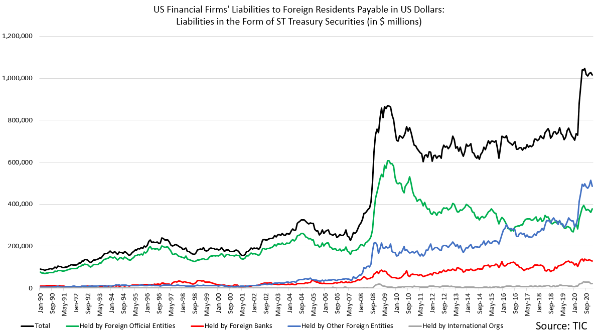
We also get a chart of US dollar assets held at US financial firms by various types of foreign accounts. The account types here are foreign governments and central banks (green line), private foreign banks (red), international organizations (grey line near the x-axis) and other foreign entities (blue). The blue line includes a variety of non-bank financial entities and starting in mid-2018 began to include offshore CLOs (primarily in the Cayman Islands) as foreign residents. This causes the discontinuity in the series since there is no data on that prior to 2018.
What we see from this chart is that while all types of accounts increased their USD holdings in the US sharply during Q1 of last year, foreign non-bank entities are the only segment where that increase has continued. Most other accounts deployed those dollars outside of the US financial system over the latter half of last year, but non-bank entities have kept adding to their holdings.
The TIC data then allows us to trim these holdings down to foreign holdings of T-Bills within the US financial system, by account type. Here we see too that foreign non-bank entities have added to their holdings the most and held steady as others have trimmed slightly. This preference for quality assets among foreign non-bank entities is not very surprising, they are definitely the most exposed part of the system in a crisis, but the persistence a year after the latest crisis began seems interesting. Note that for this series the Treasury claims that the change from the CLO reclassification was not very material, so the blue line is not split here.
Finally for the TIC data, we can look at a chart of foreign holdings of US corporate bonds and what portions of those holdings are of the asset-backed type. This data series does not go back as far and corporate bonds are more volatile in price and returns than Treasuries so the chart is more noisy, but we can still see that private holders (which make up the vast majority) have at least kept their holdings steady or possibly added more since early-2020. However appetite for US asset-backed securities has not picked up one bit, with levels flatlining at series lows. This is also interesting in terms of quality-preference from the foreign private sector as it appears US asset-backed securities are still not in style again.
Securities Industry and Financial Markets Association (SIFMA)
This leads nicely into the next data set from SIFMA that can tell us a bit more about the supply of US asset-backed securities. Let’s wrap up with a few charts from here!
The first chart shows that issuance from the public sector Agencies has been robust. The majority of the recent boom in refinancing and housing sales has been financed through this surge of issuance. In this data series SIFMA breaks it down between simple pass-through mortgage-backed securities and collateralized mortgage obligations (CMOs) that have a more sophisticated tranching structure for divvying up principal and interest cash flows separately and can thus more accurately specify their duration. The side note here is that some of these bonds can avoid the convexity problems discussed earlier through more advanced engineering.
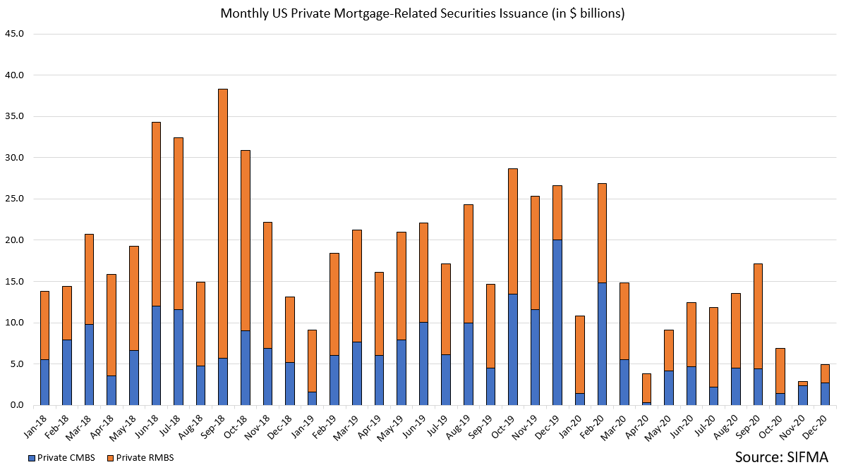
On the private side of the mortgage-backed securities market 2020 was however an anemic year. Private securitizations already account for a small portion of post-GFC mortgage finance and the past year has been weak even by those standards. With the Agencies operating at such a brisk pace this is not slowing down the housing market materially, but I think points to a continuation of the theme we observed in the last chart from the TIC data. The existing demand for private US mortgage-backed securities seems not enough to stimulate more supply.
For a final chart, SIFMA also shows us issuance of non-mortgage asset-backed securities in the US, which are all done by the private sector. Here 2020 was also a very weak year for all categories, though auto-related issuance managed to avoid the dramatic collapse of the other categories. The persistent weakness and lack of demand for less-liquid private sector issuance in these data sets is one of the more concerning themes I see here today. In theory it should reverse given the natural progression of an economic recovery, but I will definitely be watching it closely as we go.
That’s it for this week’s Chartbook! Thanks for reading if you made it all the way through, and look out for the next one about a week from now… issues may vary slightly in length and timing but more are on the way!
Cheers,
DC


Thanks, very informative for non-experts like me. Is there any significance to the spike in Agency MBS issuance in October 2020?
Thank you a lot for the time you took to write all of this out. I know that collecting and presenting this takes forever. Sio thank you a lot for your work!